Gerundio + Wemerang
How to give a face to a super powerful project?
Translating a global movement into a brand
Services
- Brand & Communication
- Experience & Interaction

Challenge
Wemerang is the first crypto-economy driven application created to empower everyday heroes and see the good of people, animals and the planet.
Understanding the reach and impact of this tool, we set out to infuse its essence into every moment of the development and brand experience.
Solution
Wemerang is a brand with soul in every sense of the word, so the strategic and design process was guided by the intention of creating a meaningful experience for everyone who comes in contact with it.
In collaboration with the Wemerang team, we created the components that lead to the brand strategy. We defined a simple and forceful value proposition that would connect with all those people who are already in action and inspire those who want to do it and don’t know where to start.
We named the brand, seeking to encapsulate the purpose and alluding to collaboration. Wemerang is a name that is all about cause and effect, about the power of doing something together to impact the world, while suggesting the movement of a boomerang.
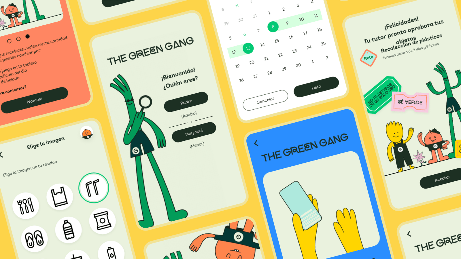
We designed a passionate visual and verbal identity that celebrates heroes at the right moments and inspires others. A brand that injects energy and serves as a tool to mobilize people. The lightness, simplicity and optimism with which it is born, is contagious.
With this in mind and being the app the main point of contact, it was important to incorporate all the strategic and identity part in the interface design. So we translated the brand elements to the UI in order to achieve an attractive and practical experience at the same time, where the emotional works with the functional and vice versa.
Likewise, we helped to bring order to the design system. Being a startup, it was essential to provide a structure that would allow them to have resources at hand and give clarity to those who would be joining the team.
En colaboración con el equipo de Wemerang, tejimos los componentes que dan lugar a la estrategia de marca. Definimos una propuesta de valor sencilla y contundente que conectara con todas aquellas personas que se encuentran ya en acción e inspirara a quienes desean hacerlo y no saben por dónde empezar.
Bautizamos la marca, buscando encapsular el propósito y haciendo alusión a la colaboración. Wemerang es un nombre que nos habla de la causa y el efecto, del poder que existe en juntos hacer algo por impactar el mundo, mientras insinúa el movimiento de un boomerang.
Diseñamos una identidad visual y verbal apasionada, que celebra a los héroes en los momentos correctos e inspira a otros. Una marca que inyecta energía y funge como herramienta para movilizar a las personas. La ligereza, naturalidad y optimismo con la que nace, se contagia.
Con esto en mente y al ser la app el punto de contacto principal, era importante embeber toda la parte estratégica y de identidad en el diseño de la interfaz. De manera que tradujimos los elementos de marca al UI para lograr una experiencia atractiva y práctica a la vez, donde lo emocional trabaja con lo funcional y viceversa.
De igual manera, ayudamos a dar orden al sistema de diseño. Al ser una startup, era fundamental brindar una estructura que les permitiera tener a la mano los recursos y dar claridad a quienes se unan al equipo.


Impact
- Communicating brand personality
- Aligning the app experience
- Organizing the Design System
Learning
“Making Wemerang’s purpose our own led us to set up a brand that is making headway with great strength.”

“I highly value the attitude and professionalism of the team, the quality of their work, the depth of their analysis and their ability to synthesize and extract the most valuable aspects of my business with empathy and expertise.”
– Alejandro Souza / Co-Founder Wemerang